The Pinch That Proves It's Not Symmetry
Discover how Threads' Pinch feature helped me break the illusion of symmetry in photography, revealing the true power of intentional composition.
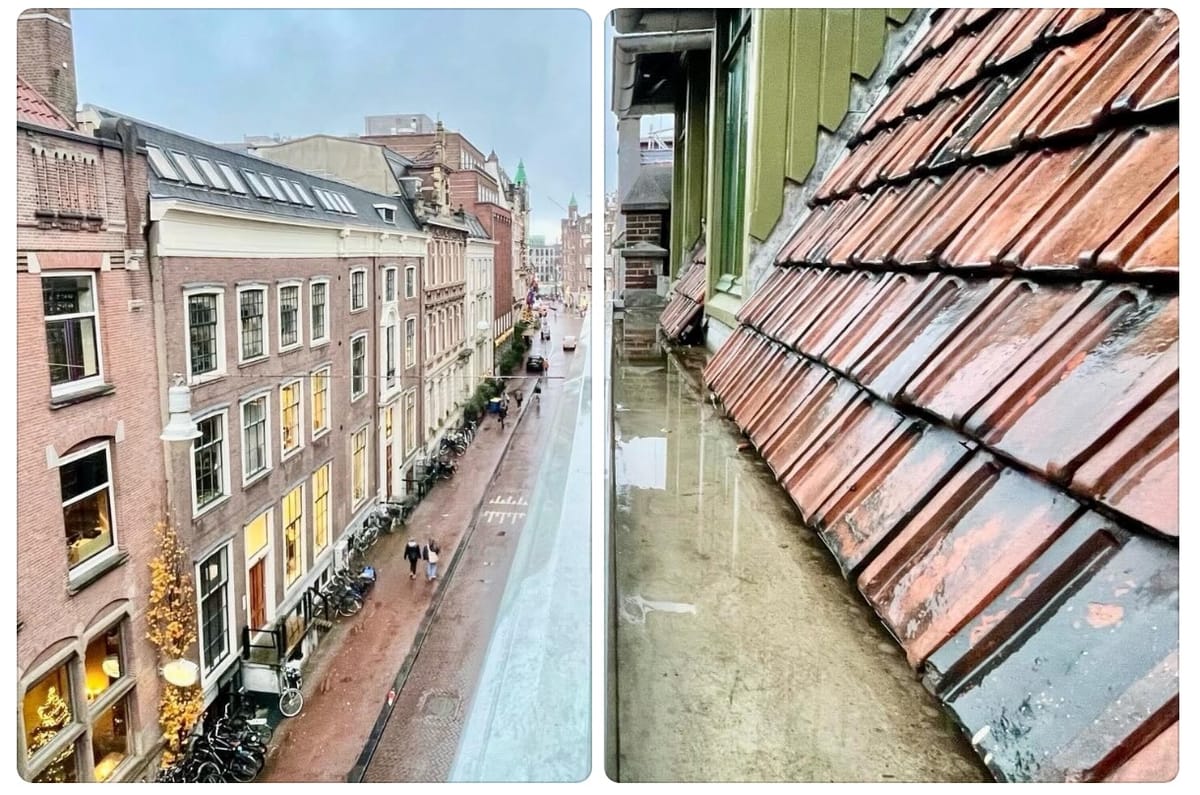
Photography has this wonderful ability to challenge what we see—or think we see. A recent photo of mine sparked a lot of comments about its “symmetry,” but here’s the thing: it’s not symmetrical. And that’s precisely what I love about it.
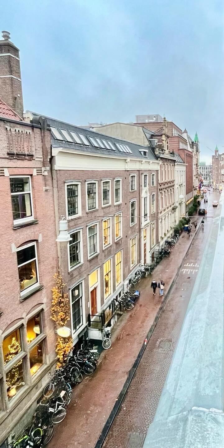
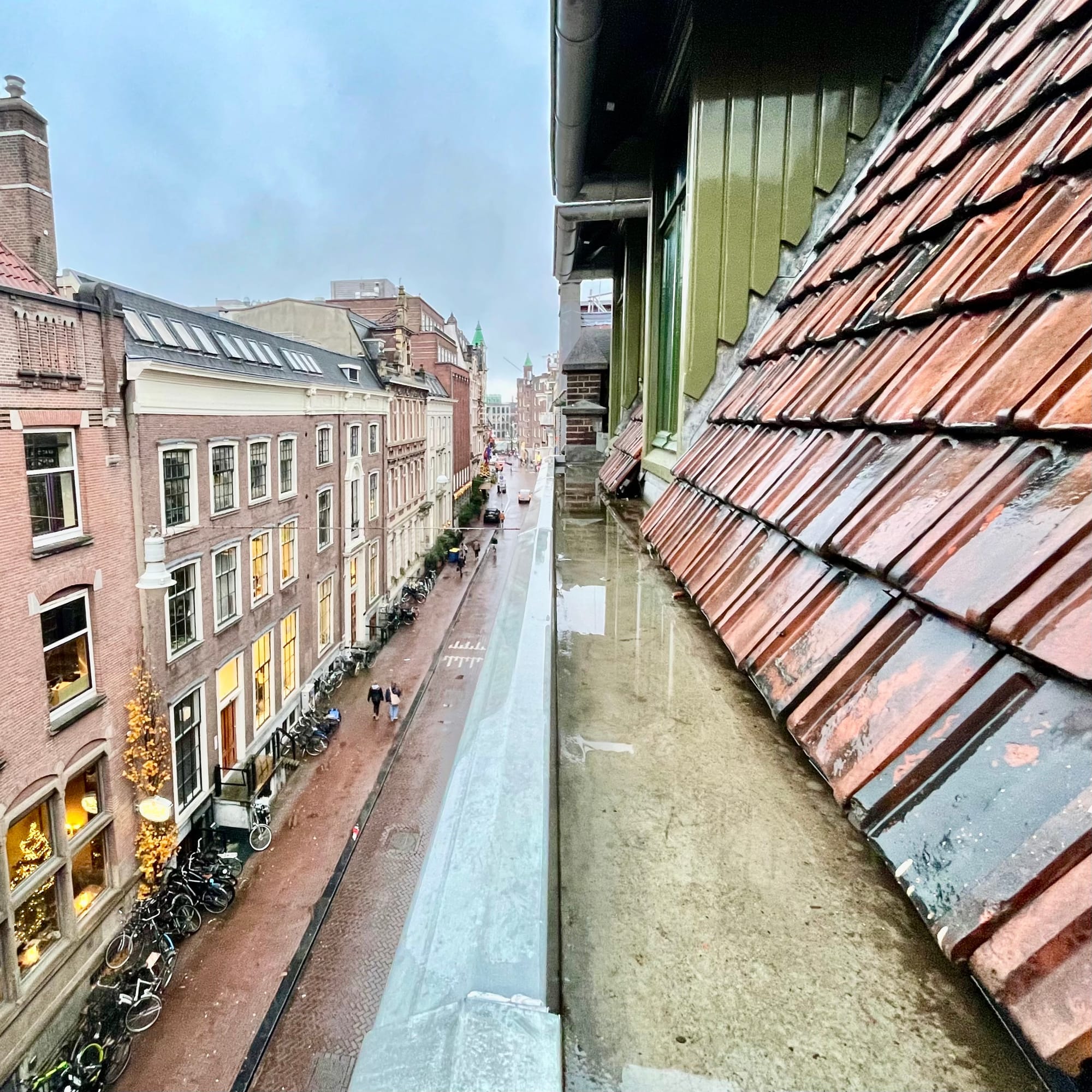
The shot in question was of an Amsterdam street, taken from above, with its rooftops, windows, and reflections guiding the eye into the distance. It has a single-point perspective—your eye naturally travels along the street to the depth of the frame. But symmetry? Look closer. It’s an illusion.
I actually worked on the composition to make it feel harmonious. The split line wasn’t originally centred; it was at two-thirds horizontally. By cropping the image to a square and placing the split line dead in the middle, I created a stronger sense of balance. But balance isn’t the same as symmetry. It’s composition that makes it work.
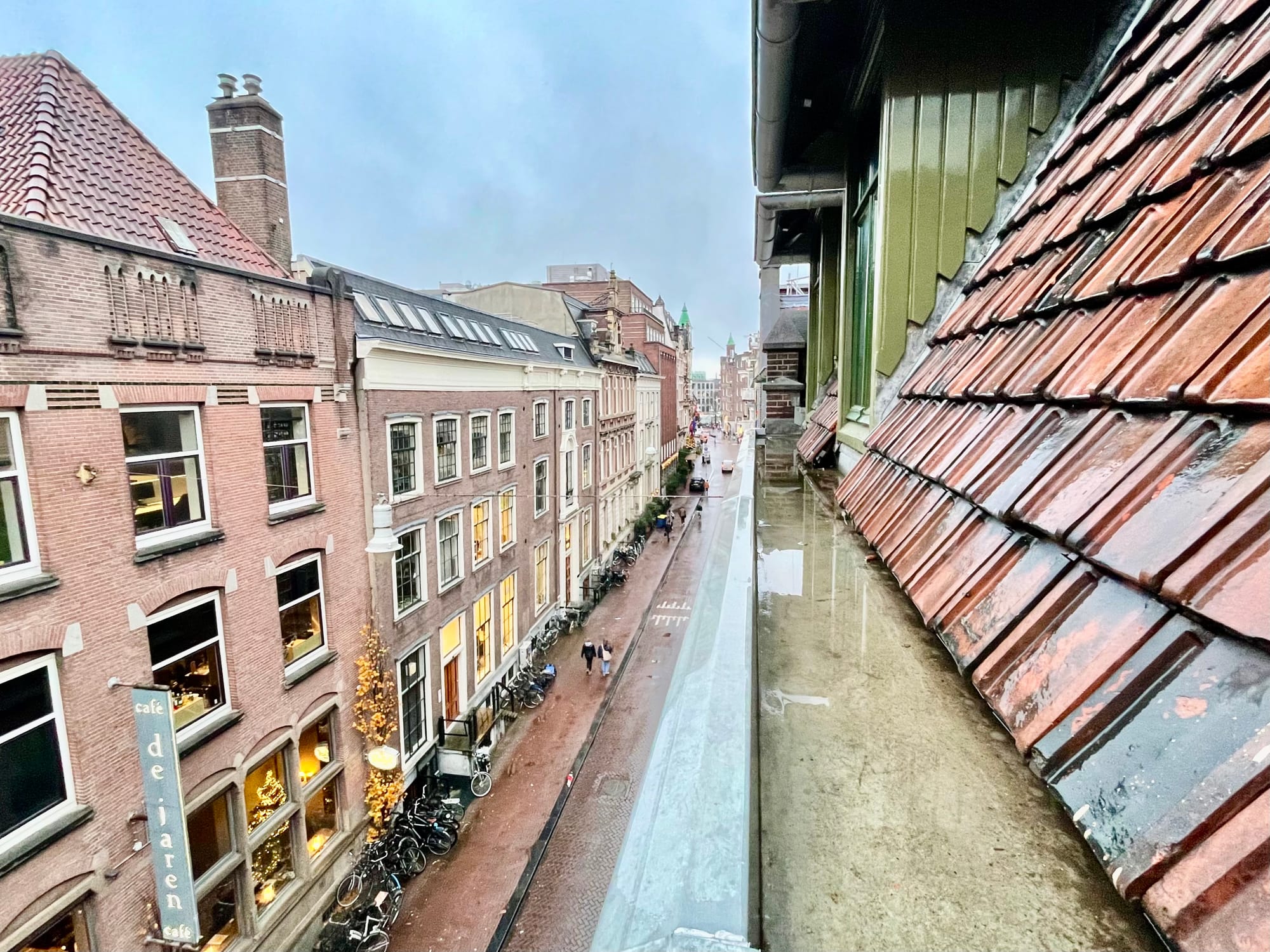
This brings me to a tool I’ve recently fallen in love with: the Pinch feature in Threads. It lets you divide a photo into two perfect halves, effectively splitting the image and encouraging you to examine it differently. When I used it on this photo, it clarified what I’d been feeling all along: this isn’t about symmetry—it’s about harmony in composition.
Splitting to See More
By pinching the photo, you can immediately see how different the two halves are. On the left, there’s the charming geometry of Amsterdam’s brick facades, their warm lights glowing against the grey day. On the right, the sharp angles of the roof tiles and the glossy reflection in the gutter. The two sides contrast and complement each other, but they’re far from mirror images.
The Threads pinch feature at work
What the Pinch feature does is guide your eye to the composition itself. It strips away the illusion of symmetry and makes you appreciate the balance and the depth created by the single-point perspective. It’s fascinating how a small edit can reveal so much more about a photo’s structure.
Why Composition Matters More Than Symmetry
Symmetry can be beautiful, but for me, it’s the intentional composition that gives a photo its soul. By centring the split line, I wasn’t aiming for perfection or duplication—I was creating a visual rhythm that guides the viewer. The centred perspective draws you in, and the contrast between the two halves keeps you engaged.
Using the Pinch feature reinforced this idea. It not only lets me experiment but also helps me see my own work with fresh eyes. When the halves are split, the composition becomes even more apparent, and the illusion of symmetry falls away.
Experimenting with Pinch
For photographers who love playing with depth, contrast, or abstract ideas, this feature in Threads is worth exploring. It’s not just about creating something new—it’s about discovering what’s already there.
I’ve included the video above to show how the Pinch feature works (touch screen only) and how I used it on this photo. If you’ve ever wondered how to challenge visual assumptions, or if you’re just looking for a fresh way to interact with your own photos, give it a try.
For me, this journey started with a simple photo of a rainy Amsterdam street. But through composition, perspective, and a little pinch of creativity, it became something much more.
